
USER EXPERIENCE | USER INTERFACE | DESIGN SYSTEMS
Simplifying data management processes for a multinational food and beverage company.
2022 | 6 Month Project
The Brief
With a number of brands ranging from global icons to local favourites, this f&b conglomerate was looking to switch over from a legacy platform to modernise their processes. The company was looking to simplify two processes in specific, to start off:
The product master-data gathering & management process.
The customer master-data management process.
While I've always been confident about my visual skillset, this project has enabled me to grow as a user experience designer. As the sole designer collaborating with product owners and developers, not only have I gained valuable insights into UX design methedologies but I also got to see how both UI and UX fed into eachother, broadening my overall understanding.
UX Designer
Discover insights and identify opportunities for improving user experience across the platform. Work with product managers & developers from the client team to create a viable solution that works both for the users & business.
UI Designer
Translating insights into efficient workflows, low and high fidelity wireframes. Crafting a design system that is buildable and scalable.
My Role
The Process
Research
Understanding User Flows
Research Methods
Discover
Heuristic Analysis
Insights from Research
Ideate
Future Flows
Key Features
Implement
Wireframes & Prototypes
Before & After
Increased Efficiency
A significant reduction in the number of steps to completion.
Error Reduction
Reduction in number of requests sent back to user/ admin for correction.
Simplified User Experience
Seamless user experience, making it easier for the user to complete their tasks
Coherent Design System
A design system that can be scaled across future flows.
Long Story Short
With people experiencing the best of user experience across their day to day lives, the goal was to bring the same ease & simplicity to their work lives. With a legacy system in place, the challenge was working around data constraints. The solution for both user flows brought out the following:
The Brief
The Challenge
How might we simplify the master-data gathering process for an existing product or releasing a new product
Understanding User Flows
Since this stuff is not the most interesting (and confidential), here’s a dramatic enactment of the taskflow:
In a glass-tinted building, a revolutionary idea was born—RamenSplash, a ramen-infused beverage with the tantalizing taste of the last savory sip and the comforting appearance of steaming coffee on a rainy day.
The chefs crafted a flawless recipe, harmonizing ingredients in perfect balance. Manufacturers diligently recorded nutritional information, meticulously noting calories, fat content, and every healthy and indulgent aspect. The designers worked out a kick-ass name and perfectly ergonomically designed vessels. The marketing team devised an effective advertising campaign, and the sales team sealed deals with all the grocery stores in town.
But as the teams reveled in their triumphs, a formidable challenge lay in their path—the legacy platform. It served as a crucial master-data repository but posed complexities, hindering efficiency, user experience, and access to vital information. Poor user experience stood as an obstacle leading to errors that reduced efficiency, flows that were hard to decipher and struggles in accessing the right information at the right time, hindering their ability to make RamenSplash a reality. Uniting the pieces became a formidable task, demanding the teams' unwavering efforts. Undeterred, they resolved to conquer the challenge.

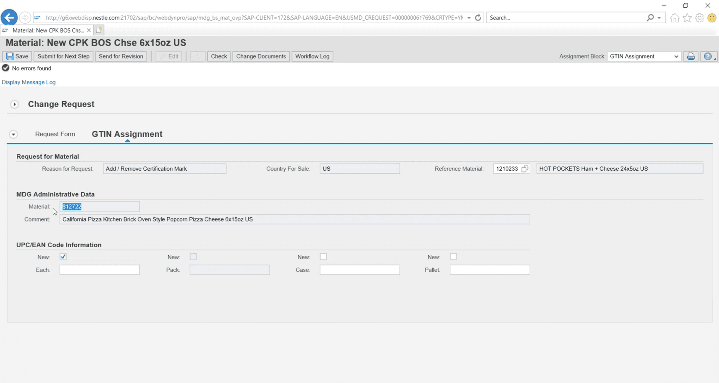
TLDR; Before a product is released, it has to be vigorously documented. A product has around 100 data fields, which is dispersed over different job roles. The legacy system is where all players come to input the data they own. This is then consolidated to document the new product. Additionally, this is also where any changes can be made to existing products.
Research Methods
The above task flow was generated through User Walkthroughs where I sat down over online sessions with the users to understand their process and observe how they achieved their task.
Interview Outline

Task Walkthroughs

Post-Interview Analysis

Discover
Heuristic Analysis of the Legacy System
By examining 10 Nielsen heuristics, I analyzed the strengths and weaknesses of the existing system. This proved particularly beneficial when evaluating a legacy system as it provided a framework to organize my thoughts and evaluate its usability.


Visibility of System Status
User Control & Freedom
Error Prevention
Recognition Rather Than Recall
Help Users With Errors
Match Between System & Real World
Consistency & Standards
Flexibility & Efficiency of Use
Aesthetic & Minimalist Design
Help And Documentation
Insights from Research
Tasks completed through rote behaviour
Users have used the system repeatedly enought to have have memorized the steps to complete a task, rather than understanding the underlying logic or design.
Possible Intervention:
More intuitive interactions, with clear system status indicators. Decreasing the need to exit a screen to retrieve information.
Workarounds are part of the process
Users have found ways to workaround limitations of the platform, and now perform tasks in line with them.
Possible Intervention:
What are the users aiming to achieve through the workaround and how can we integrate them into the future state?
Users sift through large amounts of data for a single request
Users comb through a variety of data to find relevant fields. The system hosts a number of tables which forms the base of the system.
Possible Intervention:
How can we then, present data in a way that makes it easier for the users to interact with it?
Error Messaging not clear & Error prevention not efficient
Users comb through a variety of data to find relevant fields. The system hosts a number of tables which forms the base of the system.
Possible Intervention:
Reduce the ability for users to make an error in the first place
Ideate
Future Flows
I then drew out future flows, making sure the client was aligned with them.
As a majority of the users have adapted to the existing ways of working, we consciously nurtured familiarity. For example, the user worked best with Excel, so we integrated features that were similar to it.
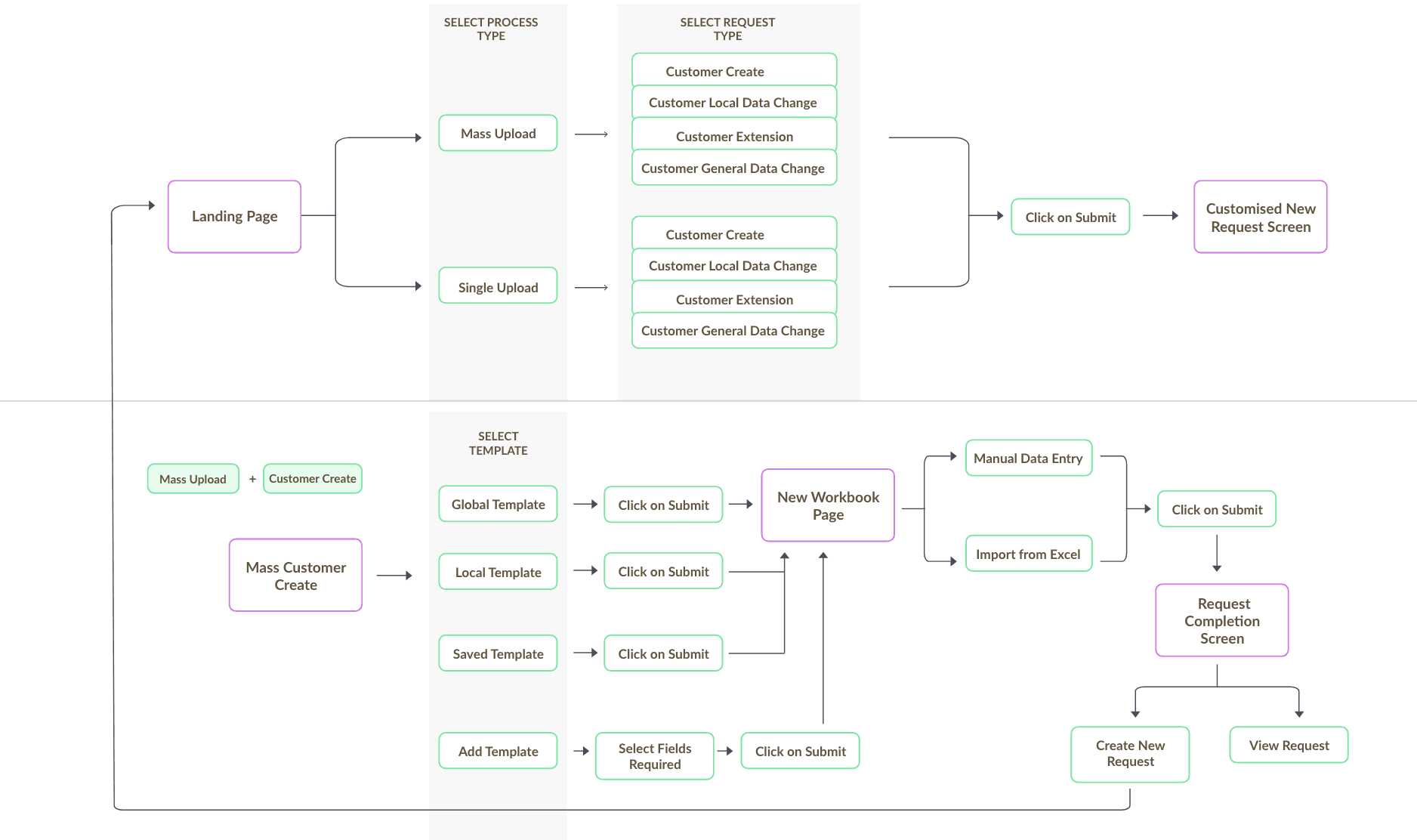
Key features
Role-based Views
Making sure each user views relevant information to them with clear CTAs

Reduced friction by reducing deviations from primary task
Minimized the number of unnecessary exits or disruptions, ensuring a smoother and more streamlined user experience.
Enhanced error messaging
Uncomplicated error messaging, with a focus on resolving them without escalations and reducing error possibilities.


Summary & Status Indications
Reinforcing progress indicators and status updates of each request thats created. Introduced summary pages before submission and a request worklog page.
A brand-inspired design system
A growing design system, designed around Microsoft PowerApps on which the playform is hosted.


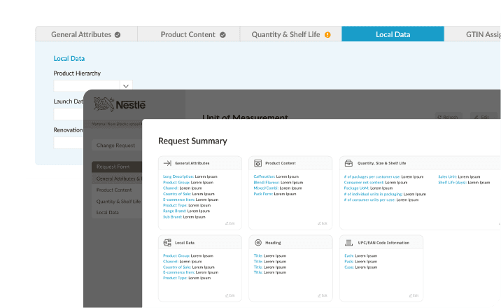
Implement
Wireframing to High-Fidelity Prototypes

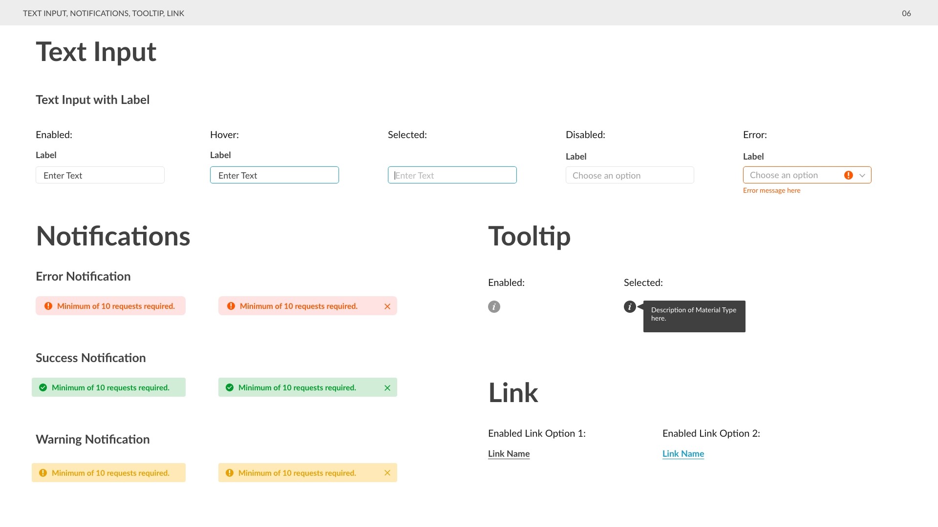
An Expanding Design System


View More


Like what you see? Email me at pvinati@gmail.com :)
Last Updated May 2023