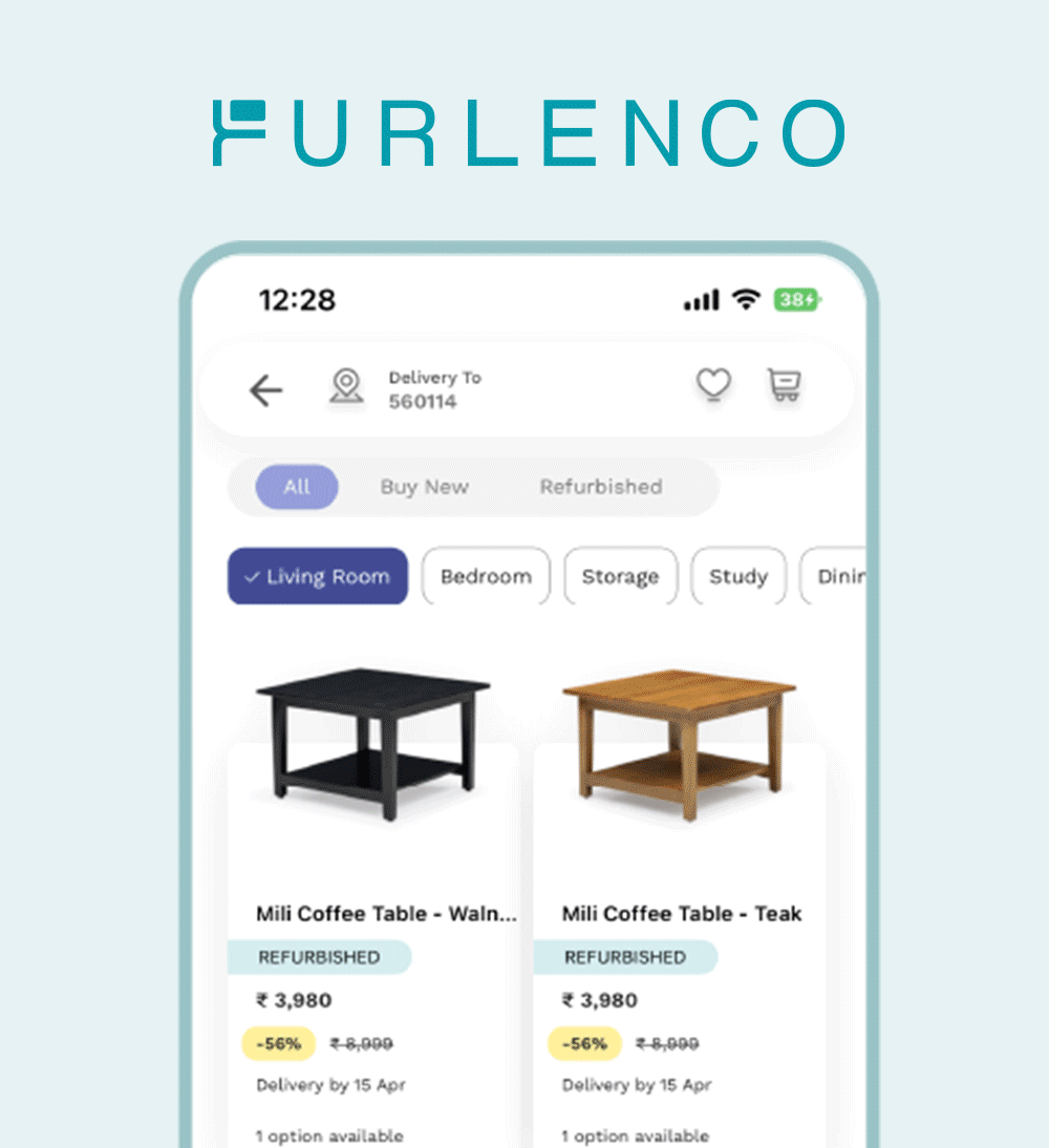
Logo Design | Branding | Developing Visual Identity
Rebranding a leading Indian furniture rental company.
2022 | 3 Months Project
The Brief
Back in 2011, Furlenco started off as a furniture rental platform, bringing about a fundamental change in how the urban Indian consumed furniture. Today, Furlenco provides its customers with the freedom of choice (to choose any furniture they want), freedom of access (in whatever way they want), and freedom of change (by returning or selling back) - offering solutions that give people the freedom to furnish their homes as they like.
After 10+ years in the market, Furlenco is gearing up to expand their offerings. As they diversify, Furlenco wanted to take this opportunity to refresh their branding. With essential subscription models and a strong vision in mind, what we saw was a need for a visual identity that matched and so we started.
My Role
Contract Visual Designer
Worked for Webecray in a team led by Divya Rani where my responsibilities included gathering insights and translating them into conceptual ideas for client pitches. I collaborated with Shivani Kannan and Tanmaya.
Long Story Short
With Furlenco’s key offering being “Freedom” we set out to create a logo and visual language that expresses both furniture and flexibility. We focused on maintaining the integrity of the existing brand. We did not want to reinvent the brand, only refresh it. This translated to bold shapes, strong lines, solid typography; and a visual world that is simple, understated and strikingly confident.
The Brief
Brand Understanding
FURLENCO'S OFFERINGS
Breaking the furniture commitment.
What makes the furniture company stand out is its core offerings - flexibility and accessibility. It offers its customers the freedom to change as their needs change.
Easy Access to Furniture
From buying to returning, furnitures model makes sure its customers experience seamless interactions through their online portals.
Assured quality and tasteful designs
With their inhouse design studio that creates designs that would fit into anyones homes.
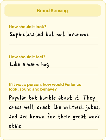
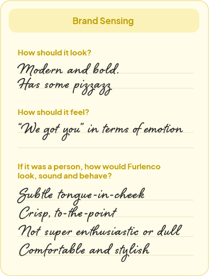
Furlenco’s Brand Sensing
Over an online session, We gathered a few Furlenco employees from designers to leaders to understand what they think the brand stood for.

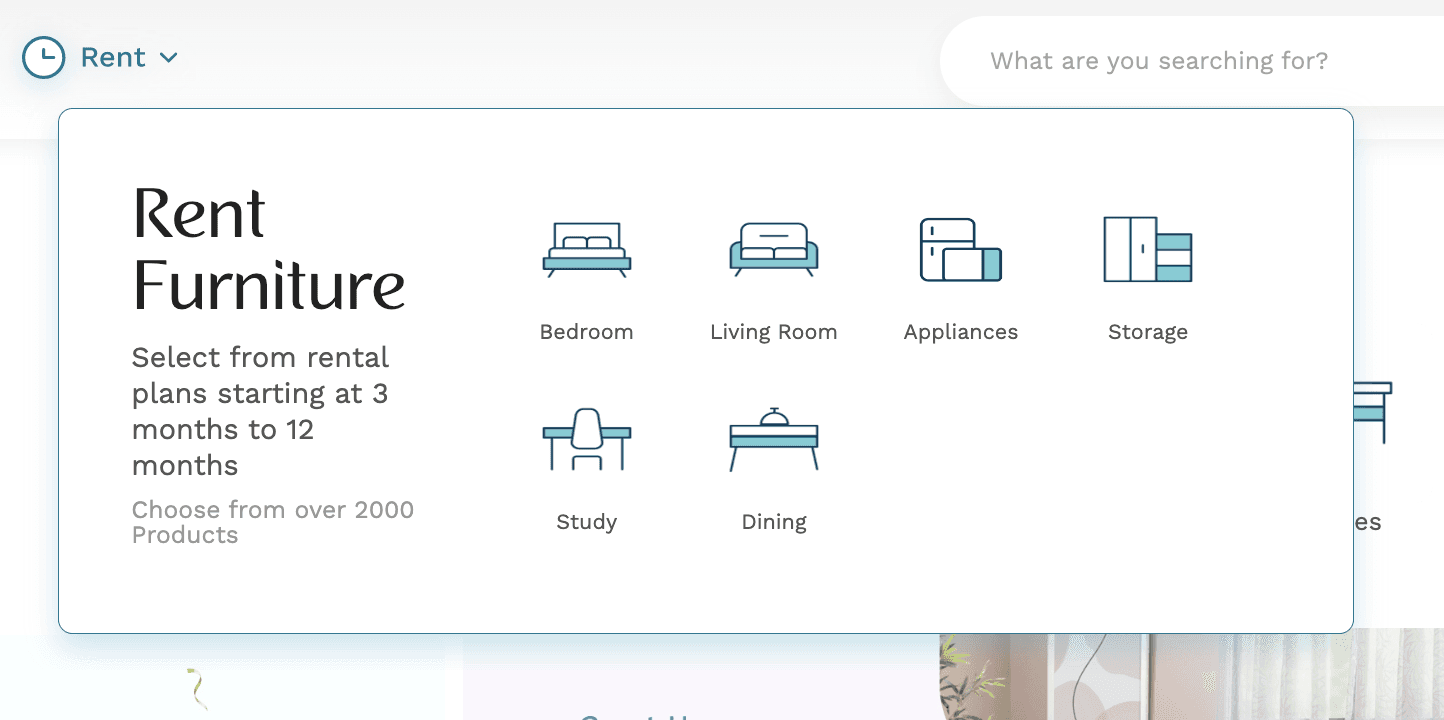
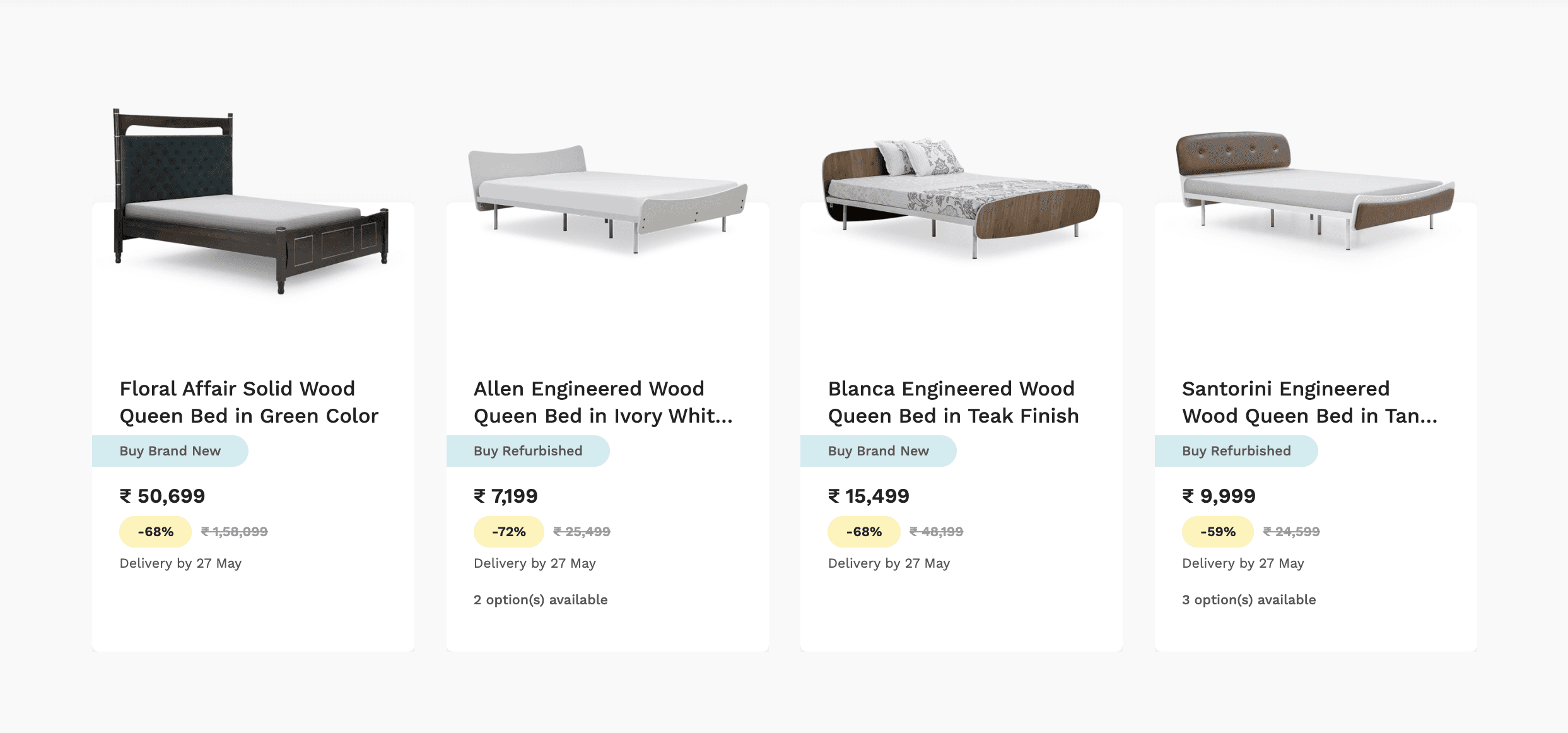
EXISTING BRANDING


Target Audience
To understand the Furlenco audience, we drew out two key personas.
The Urban Nomad
Age: 26, Unmarried
Occupation: Engineer at Startup
Key Qualities: Friendly, Go-getter
Aparna’s Story:
Aparna recently relocated to Bangalore for a job. She looks forward to setting up her new place with her flatmate. She’s vocal about her likes and dislikes, actively uses social media and spends her free time trying out new activities around town and meeting up with friends.
Brands they use: Bumble, Swiggy, Myntra, Bob’s Bar
What do you look for in furniture? (paraphrased)
“ Im quite picky yet determined to find the nicest looking furniture at the best cost. I’m quite inclined to buying second hand or renting. Besides, i dont even know if i will still need it in a year, what then? Im not ready to commit! “


The Aspirer
What do you look for in furniture? (paraphrased)
Age: 30-34 years old, Married
Occupation: Finance & Ad Agency
Key Qualities: Focused, Dreamers
Arjun and Sara’s Story:
Arjun and Sara are a newly-wed couple. Both work a day job and have achieved a routine, of balancing both work and personal lives. They have the same taste in music, enjoy exploring new cuisines, look forward to hosting people and plan on raising a pet together. They do not like to compromise, and always make informed decisions.
Brands they use: Apple, Oneplus, CRED
“ We want our furniture to last, so where we buy it from and quality matter most. We take our research pretty seriously, especially because we want furniture that lasts”
Discover
Insights from Research
Furlenco = Freedom
We found that the brand’s strongest proposition was “freedom” in all aspects.
Possible Intervention:
How do we showcase freedom visually?
Opportunity to showcase the dynamic nature of the brand.
The furniture you want & the furniture you need.
The brand goes beyond their proposition of flexible furniture rentals by also emphasising on their tasteful inhouse designs.
Possible Intervention:
Can we use their large repository of product photography. How do we integrate this with the new brand?
Brand Archetype:
70% Creator,
30% Jester
With creating new products and services that are unique to their market, the brand values originality. Infused with enthusiasm, honesty and wit.
Possible Intervention:
The new brand needs to be fresh and bold. Opportunity to diversify, bringing in colours or visual elements that show confidence.
Refresh, dont reinvent
We identified that the company leaned towards refreshing the brand, not fully reinventing it.
Possible Intervention:
Also explore routes where we pull from parts of the existing identity that work.
Ideate
PART 1
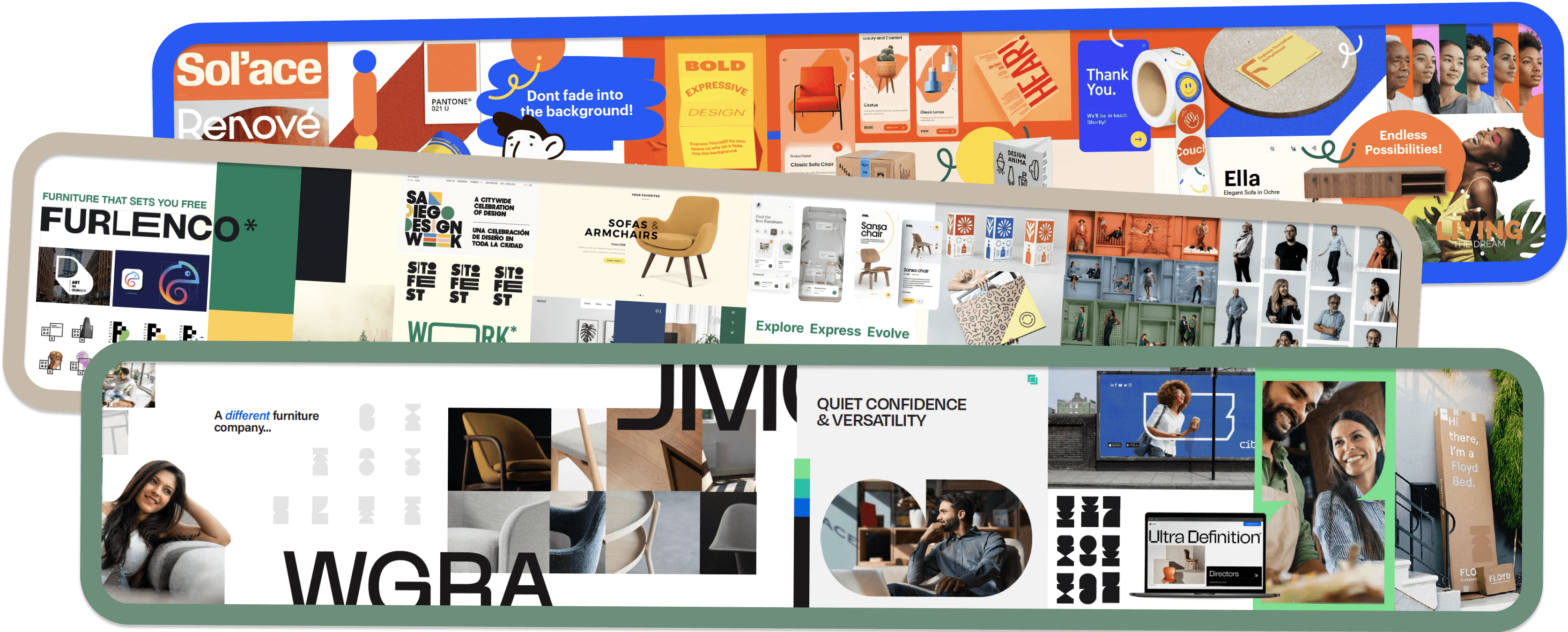
Stylescape Explorations
From a warmer colour palette to a more sophisticated aesthetic, we started off with presenting a set of stylescapes to help the company realise their future state. A stylescape is a great way to showcase the overarching personality we are targeting. Creating in silos without aligning with the clients expectations has potential for chaos while co-creating always allows for more insightful ideas.
PART 2
Visual Identity Explorations
Dynamic Furniture
This route focused on forms of furniture, combining curves and edges to create a logo mark that encompasses it all.
We looked at using parts of the logo to derive other visual elements of the brand, crafting new icons and imagery.

Your home, your way
A house is where furniture lives and it's where Furlenco belongs. This route shows how Furlenco allows you to make your house flexible, giving you infinite possibilities to make your house your home.
The logo forms an infinity. It could also symbolise Furlenco at the intersection of the house you need and the house you want.


PART 3
Logo Explorations
Some logo explorations across the process. We explored logomarks, word marks, abstract symbols and dynamic logos. In addition, we noted down what competitors in the furniture space were upto.

PART 4
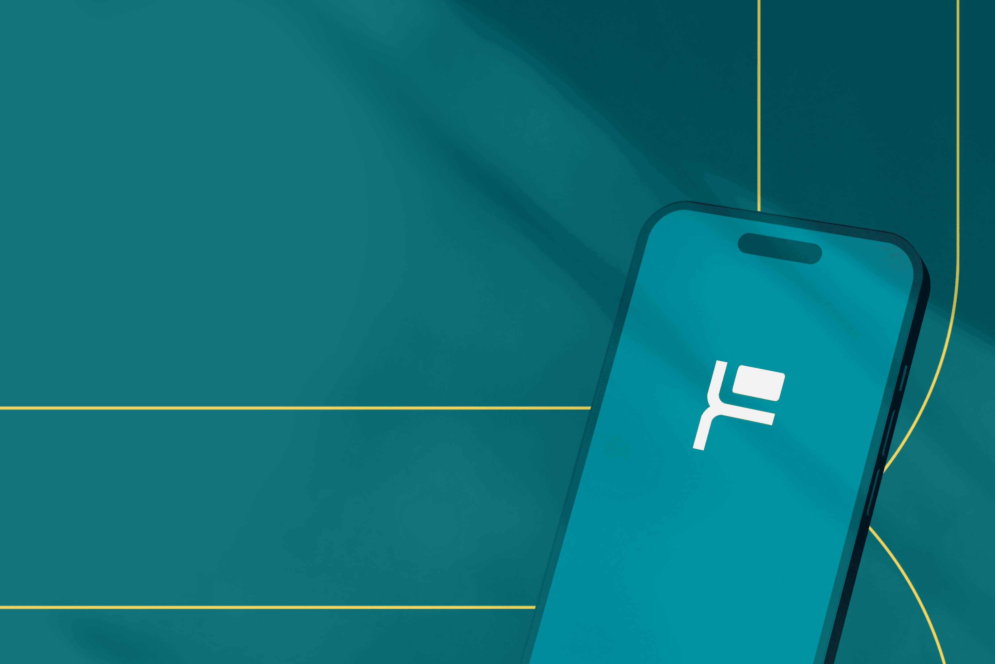
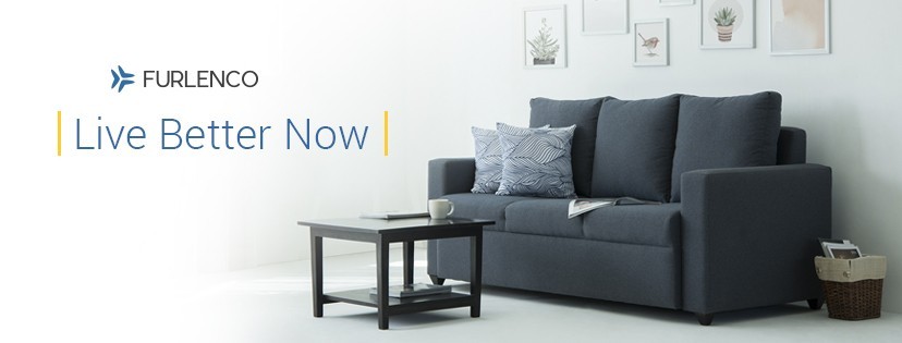
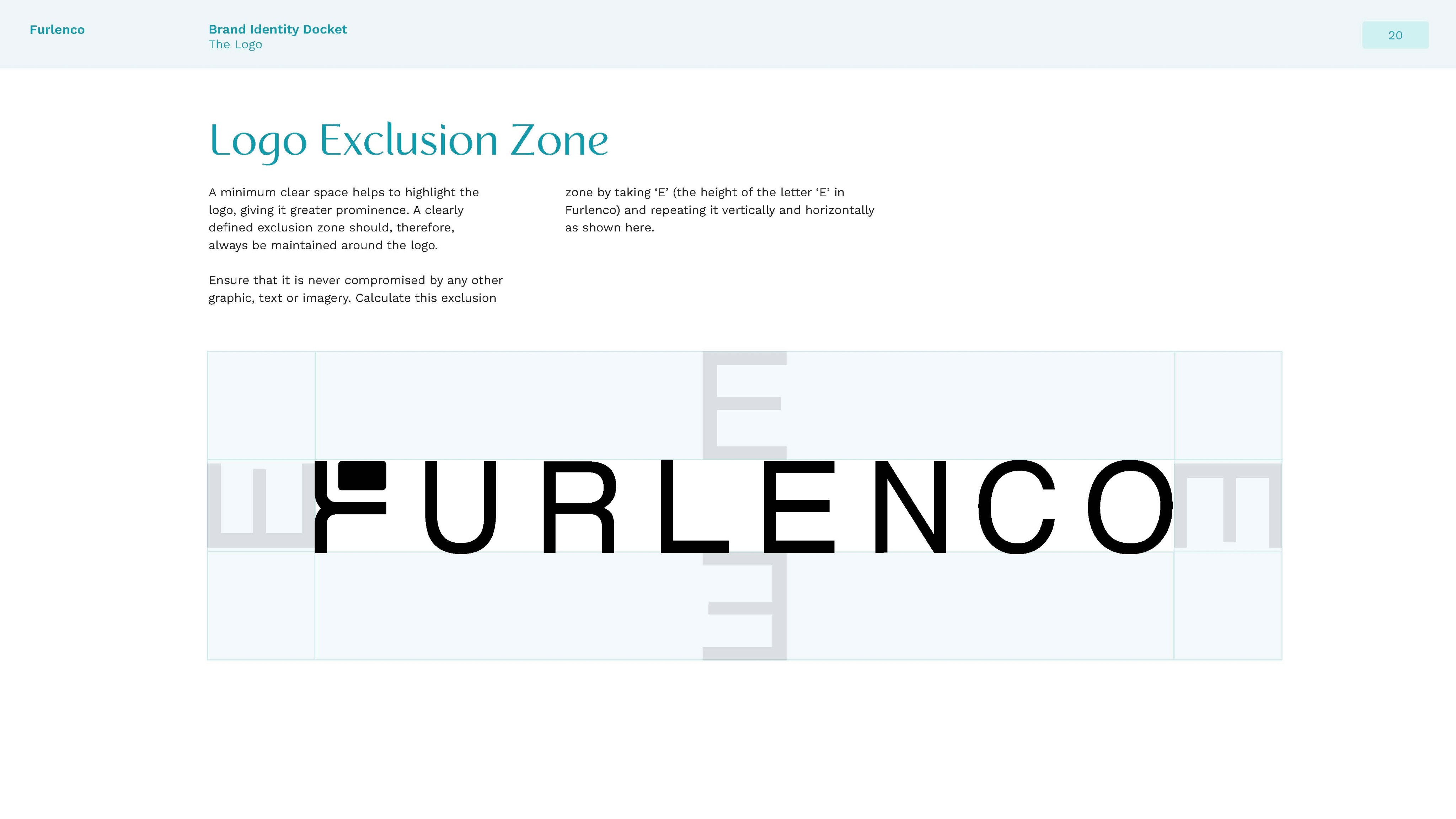
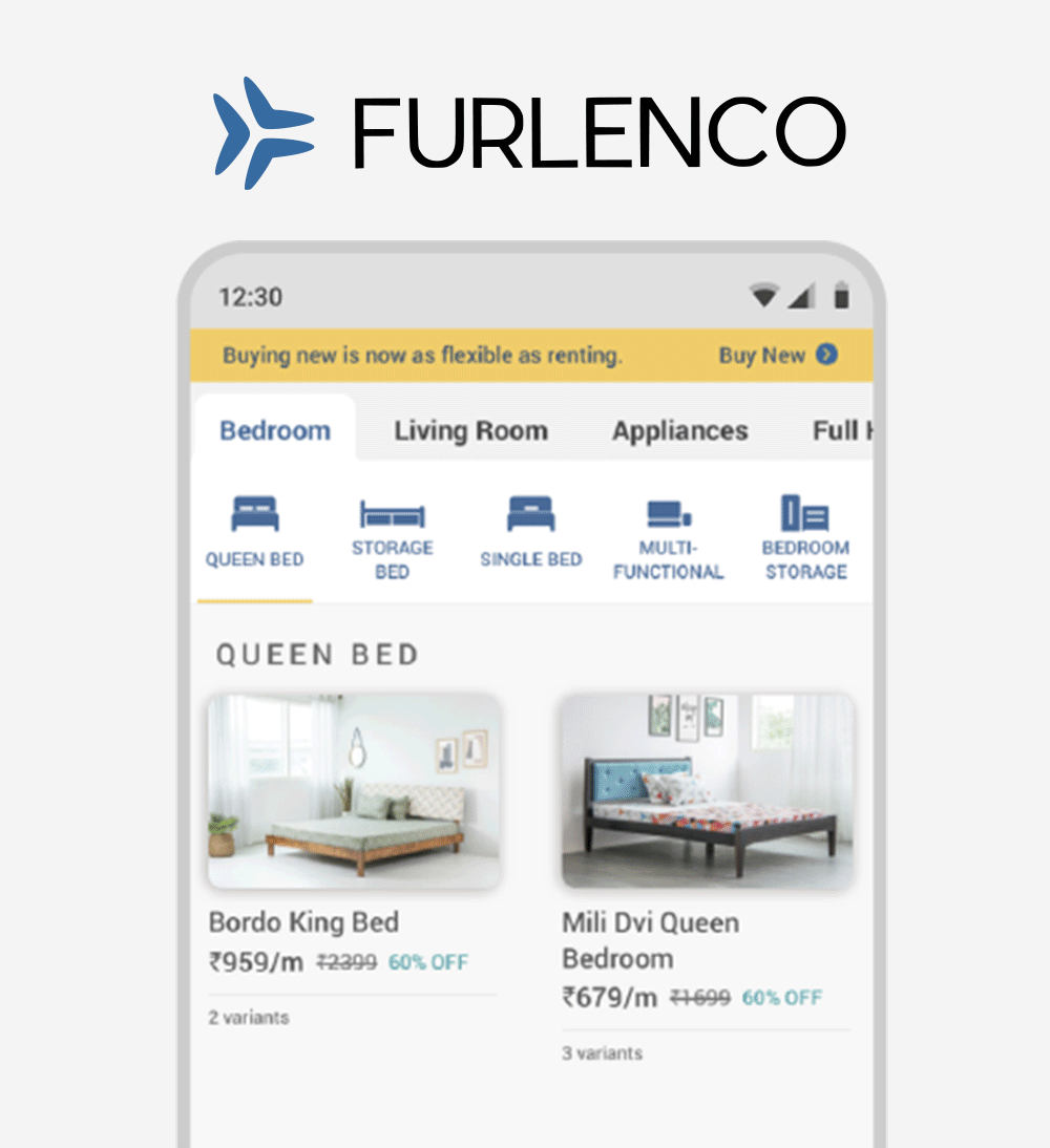
Final Logo & Branding
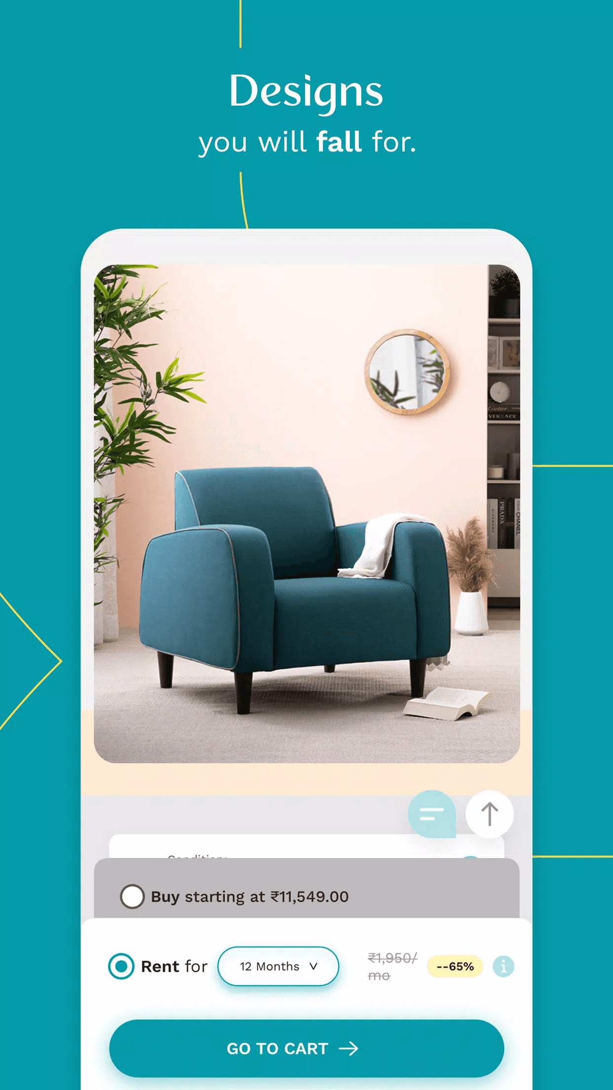
After multiple rounds of discussion, we decided to go with a simple logotype, that formed the logo. We wanted to play with the "F", teaming it with a bright and vibrant colour palette that is bold and scalable.
Finally, the typography we paired the logo and colours with was what tied the identity together.


Implement
The Brandbook
We handed-off a brand book that encompasses the essence of the re-brand.

Before & After
The rebrand translated to bold shapes, strong lines, solid typography; and a visual world that is simple, understated and strikingly confident.


View More


Like what you see? Email me at pvinati@gmail.com :)
Last Updated May 2023